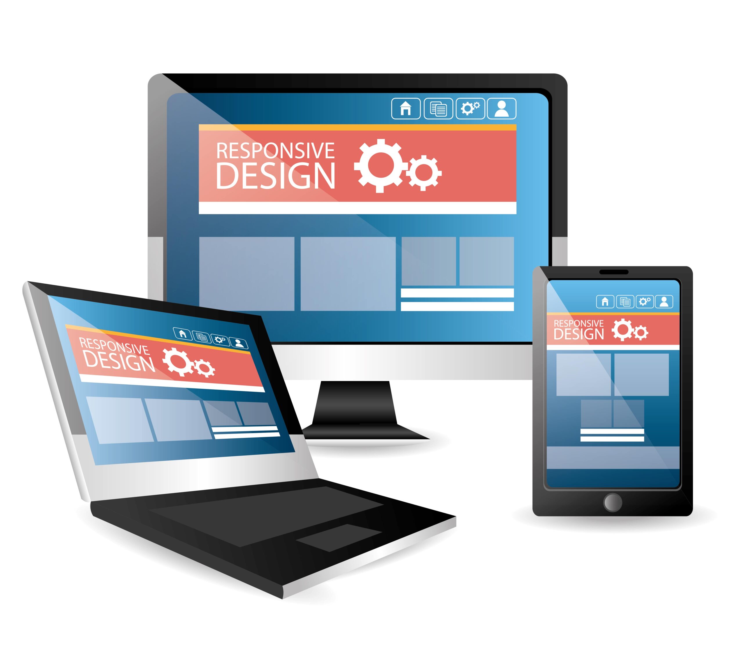
Why Responsive Web Design With HTML 5 & CSS Is Essential in 2025
Why Is Responsive Web Design With HTML 5 & CSS Critical in 2025?
Responsive web design ensures your site adapts beautifully across all devices—from phones and tablets to smart TVs. In 2025, over 60% of web traffic comes from mobile and Google prioritizes mobile-first, so building with HTML 5, CSS Grid, Flexbox, and media queries isn’t optional—it’s business-critical. It boosts user experience, performance, and SEO all at once.
Introduction
In today’s fast-paced digital environment, users expect seamless experiences across all devices. As smartphones and tablets continue to dominate internet usage, building adaptable websites has become more important than ever. This is where Responsive Web Design With HTML 5 & CSS shines. It’s not just a trend; it’s a necessity for web developers and businesses in 2025 who want to stay ahead.
What Is Responsive Web Design With HTML 5 & CSS?
Responsive Web Design (RWD) ensures that a website looks and functions perfectly on any screen size—from desktops to mobile phones. By using flexible layouts, images, and CSS media queries, developers can create dynamic websites that adapt smoothly to different devices.
- HTML 5 and CSS are the backbones of this approach. HTML 5 structures the content, while CSS styles and adapts it visually. This powerful combination allows developers to build user-centric, accessible, and attractive websites.
- Internal Linking: If you’re planning to build adaptable websites, explore our service for Hire HTML5 Developers and start with HTML and CSS Design and Build Websites.
Why It’s Essential in 2025
1. Mobile-First World
According to recent studies, over 60% of web traffic now comes from mobile devices. That means your website must be optimized for smaller screens first. With Responsive Web Design With HTML 5 & CSS, you ensure your users don’t bounce due to poor usability.
2. Improved SEO
Search engines like Google favor mobile-friendly and responsive sites. Google’s algorithm prioritizes responsive websites in its ranking. Hence, adopting responsive web design helps your site rank better, increasing your visibility and traffic.
3. Cost-Effective Maintenance
Instead of creating multiple websites for different devices, you can build one responsive website that adjusts to all screen sizes. This approach saves development time, resources, and long-term maintenance costs.
- Internal Linking: Get started with a professional HTML Website Development team to future-proof your digital presence.
Benefits of Using HTML 5 & CSS
Cleaner Code and Structure
HTML 5 allows for cleaner and more semantic code, making it easier for search engines to read and index content. Combined with CSS, it becomes easier to apply responsive styling that scales with devices.
Compatibility Across Browsers
HTML 5 and CSS are supported by all major browsers and platforms. This ensures consistent performance for every visitor.
Flexibility with Media Queries
CSS media queries are a cornerstone of responsive design. They allow developers to apply specific styles based on the device’s screen width, orientation, or resolution..
- Internal Linking: Beginners can start with HTML Projects for Beginners to practice responsive techniques hands-on.
Real-World Use Cases
E-commerce Websites
E-commerce platforms rely heavily on responsive design to provide seamless shopping experiences. A poorly designed mobile site can lead to cart abandonment.
Educational Platforms
Online learning tools and portals must adapt to students accessing them from tablets or smartphones. HTML 5 allows embedding multimedia and interactive content without needing third-party plugins.
Portfolios and Business Sites
Freelancers and businesses benefit from responsive portfolios that look professional across all devices, improving client engagement.
- Internal Linking: For robust results, consider hiring from a top HTML Development Company or Hire HTML Developer to ensure precision in execution.
Integration with Other Technologies
Responsive Web Design With HTML 5 & CSS is not isolated. It integrates seamlessly with JavaScript frameworks, CMS platforms, and back-end systems like PHP and Laravel.
- Internal Linking: For more advanced integration, you may also Hire Dedicated Laravel Developer to build full-stack responsive applications.
How to Get Started
Step 1: Learn the Basics
Understand HTML 5 tags, semantic layout, and how CSS controls layout with Flexbox or Grid.
Step 2: Use Frameworks Wisely
Frameworks like Bootstrap simplify responsive design using pre-defined CSS classes and components.
Step 3: Test Across Devices
Always test your designs using browser tools or real devices. Tools like BrowserStack or Chrome DevTools can simulate multiple environments.
Step 4: Focus on Performance
Optimize images, compress CSS files, and eliminate render-blocking resources. A faster responsive site not only enhances user experience but also boosts SEO.
- Internal Linking: You can always refer to HTML5 Development Services for professional implementation and consulting.
Common Mistakes to Avoid
- Ignoring viewport meta tag
- Not testing on real devices
- Using fixed-width layouts
- Overcomplicating CSS rules
Final Thoughts
In 2025, Responsive Web Design With HTML 5 & CSS is no longer optional—it’s a strategic requirement for businesses, developers, and startups aiming to stay competitive. Whether you’re designing your first website or revamping an existing one, adopting this approach ensures a better user experience, improved SEO, and long-term success.
- Internal Linking: Looking to scale? Connect with our Hire HTML5 Developers or explore HTML5 Development Services tailored for your business needs.
Frequently Asked Questions (FAQs)
1. What is responsive web design?
It’s a method where layouts fluidly adjust to screen sizes using CSS media queries, flexible grids, and responsive images—creating a seamless experience on any device.
2. Why is responsive design so important in 2025?
With mobile accounting for over 60% of traffic and Google’s mobile-first indexing, responsive design boosts both usability and ranking.
3. How do HTML 5 and CSS support responsive layouts?
HTML 5 provides structure, while CSS Grid, Flexbox, and media queries let you create flexible, performant layouts that adapt on the fly.
4. Can responsive design improve my site’s SEO?
Definitely—responsive sites tend to load faster, reduce bounce rates, and satisfy Google’s mobile-first indexing—boosting your visibility and engagement.


