


Responsive WordPress Design: Why It Matters for Your Website in 2025
Why Is Responsive WordPress Design a Must-Have in 2025?
Responsive WordPress design ensures your website looks and performs perfectly on all screen sizes—from mobile phones to desktops. In 2025, users expect fast, mobile-friendly experiences, and Google rewards such websites with better rankings. A responsive design isn’t just a feature—it’s a necessity for engagement and conversions.
In 2025, with mobile traffic dominating the digital landscape, ensuring your website is responsive isn’t a luxury—it’s a necessity. Whether you’re a startup, an eCommerce brand, or a government agency, having a responsive website built on WordPress can dramatically improve your user engagement, SEO, and overall conversion rate. This is where Responsive WordPress Design steps in.
Let’s explore why Responsive WordPress Design matters more than ever in 2025—and how it can completely transform your digital presence.
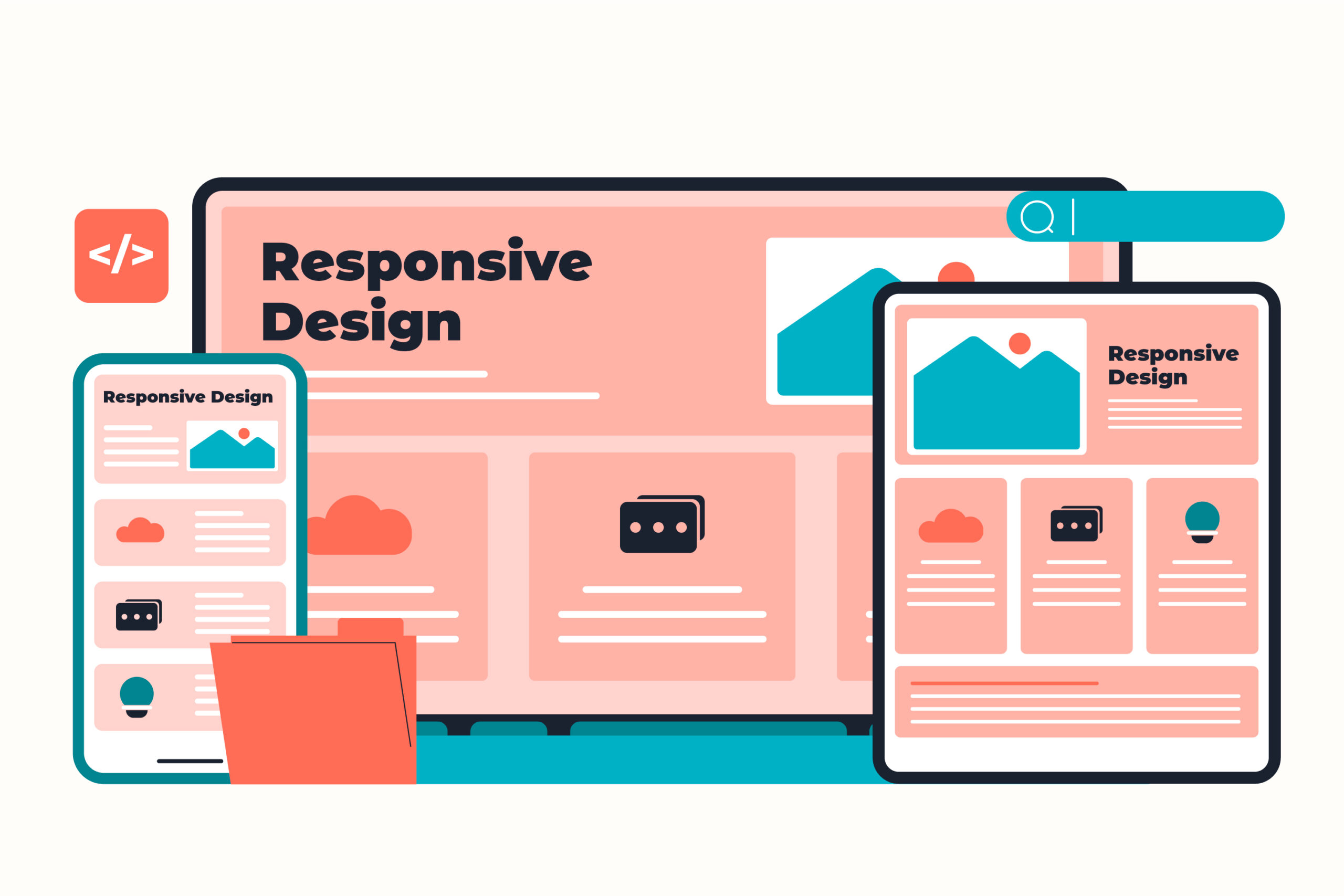
What is Responsive WordPress Design?
Responsive WordPress Design refers to a website’s ability to adjust seamlessly across various screen sizes—from desktop monitors to smartphones and tablets. Instead of creating multiple versions of your site for different devices, a responsive WordPress theme automatically adjusts layout, font sizes, images, and content hierarchy based on screen dimensions.
Key Elements of a Responsive WordPress Website:
- Mobile-friendly navigation
- Fluid grid layouts
- Flexible media (images, videos, infographics)
- Optimized loading speeds on mobile
- Touch-friendly elements
In short, it’s all about providing an excellent user experience regardless of the device being used.
Why Responsive Design Is Non-Negotiable in 2025
Here are some reasons why Responsive WordPress Design is crucial for websites in today’s competitive environment:
1. Google’s Mobile-First Indexing
Google now prioritizes mobile versions of websites for indexing and ranking. If your site isn’t mobile-friendly, you’ll likely fall in rankings. Choosing WordPress Development Services with a focus on responsiveness helps improve visibility in search results.
2. Improved User Experience
Responsive websites ensure consistency in how users interact with your content. Whether they are visiting from an iPhone or a tablet, they’ll have a smooth and intuitive experience. This is critical for businesses relying on UX, such as those offering UI/UX Design Services.
3. Faster Load Times
Mobile users are notoriously impatient. A delay of just 1–2 seconds in load time can increase bounce rates. By implementing HTML and CSS Development Services optimized for responsiveness, you ensure faster loading speeds.
How WordPress Makes Responsive Design Easy
WordPress, the most popular CMS platform in the world, offers many responsive themes and plugins that make it easy to create a mobile-friendly site without having to code everything from scratch.
Built-In Features That Support Responsiveness:
- Responsive Themes: Many free and premium themes are designed to be mobile-first.
- Plugins: WordPress plugins like WP Touch or Elementor help improve responsiveness.
- Block Editor (Gutenberg): Enables mobile previews and flexible content blocks.
Working with a custom WordPress development services company allows you to make the most of these features while tailoring your site to your unique needs.
Industries That Benefit the Most from Responsive WordPress Design
While every industry benefits, some are especially reliant on mobile traffic and responsive performance:
- eCommerce: Mobile purchases are booming.
- Education: Students access content on smartphones and tablets.
- Healthcare: Patients often look up symptoms or book appointments via mobile.
- Government: For ease of access, citizens must interact with portals on mobile-friendly interfaces. Check out some of the Best Government Website Designs that have embraced responsiveness.
Common Mistakes to Avoid in Responsive WordPress Design
Even with the best tools, businesses often fall into common traps:
- Using unoptimized images that slow down mobile loading
- Cluttered navigation that confuses users on smaller screens
- Inflexible layouts that don’t adapt to new screen sizes
- Overreliance on plugins that bloat your website
This is where collaborating with professionals who specialize in Laravel Development Services and WordPress Development Services can help streamline both design and backend performance.
How Responsive Design Impacts SEO
Google prefers mobile-first sites. Here’s how Responsive WordPress Design boosts SEO:
- Improved Page Experience Signals
- Lower Bounce Rates
- Higher Time-on-Site
- Easier Crawling and Indexing
Pairing your SEO strategy with solid development, like what you get from HTML and CSS Development Services, ensures your site ranks higher.
Case Study: A Small Business That Tripled Conversions
A retail business in Melbourne worked with a team specializing in WordPress Development Services and UI/UX Design Services to revamp their website using responsive design. The result?
- Bounce rate dropped by 40%
- Mobile conversions increased by 3x
- Page speed improved by 50%
Responsive design wasn’t just a design update—it was a business upgrade.
How to Get Started with Responsive WordPress Design
Here’s how you can implement Responsive WordPress Design on your site:
Step 1: Choose a Responsive WordPress Theme
Start with a theme that’s built for responsiveness out of the box. Astra, OceanWP, and GeneratePress are great examples.
Step 2: Audit Your Existing Website
Use tools like Google’s Mobile-Friendly Test or GTmetrix to find out where your site needs improvement.
Step 3: Partner with the Right Developers
Hire a team skilled in Laravel Development Services, WordPress Development Services, and UI/UX Design Services for best results.
Step 4: Optimize Media and Fonts
Use WebP images and system fonts for faster loading times across devices.
Step 5: Test Across Devices
Make sure your site performs well on iOS, Android, tablets, and desktops. Use emulators or real-device testing tools.
Internal Linking for Further Reading
- Want a deep dive into coding basics? Read our post on HTML and CSS Design and Build Websites.
- Looking for backend support? Explore our Laravel Development Services.
- Interested in frontend aesthetics? Browse our UI/UX Design Services.
- Thinking of a full site redesign? Start with our WordPress Development Services.
Final Thoughts
The importance of Responsive WordPress Design will only grow as more users rely on mobile devices to shop, learn, and connect. A responsive website not only enhances user satisfaction but also helps you stay competitive in search engine rankings and drive better ROI.
If you’re building a site in 2025—or even refreshing an old one—make Responsive WordPress Design your top priority. From clean code to mobile optimization, it’s the key to building trust and engagement with your audience.
Frequently Asked Questions
1. What is responsive WordPress design?
It means your website automatically adapts its layout and content to fit any screen size—whether it's a mobile phone, tablet, or desktop. This improves user experience and engagement.
2. Why is responsive design important for WordPress websites?
Because most users browse from mobile devices. A responsive site loads faster, looks better, and performs well—leading to better SEO, lower bounce rates, and higher conversions.
3. Can I make my existing WordPress site responsive?
Yes! You can switch to a responsive theme or use plugins and custom CSS to adjust your current site’s layout for mobile and tablet devices.
4. Do responsive WordPress sites help with SEO?
Absolutely. Google prioritizes mobile-friendly websites in search results, so having a responsive design boosts your visibility and rankings.


